
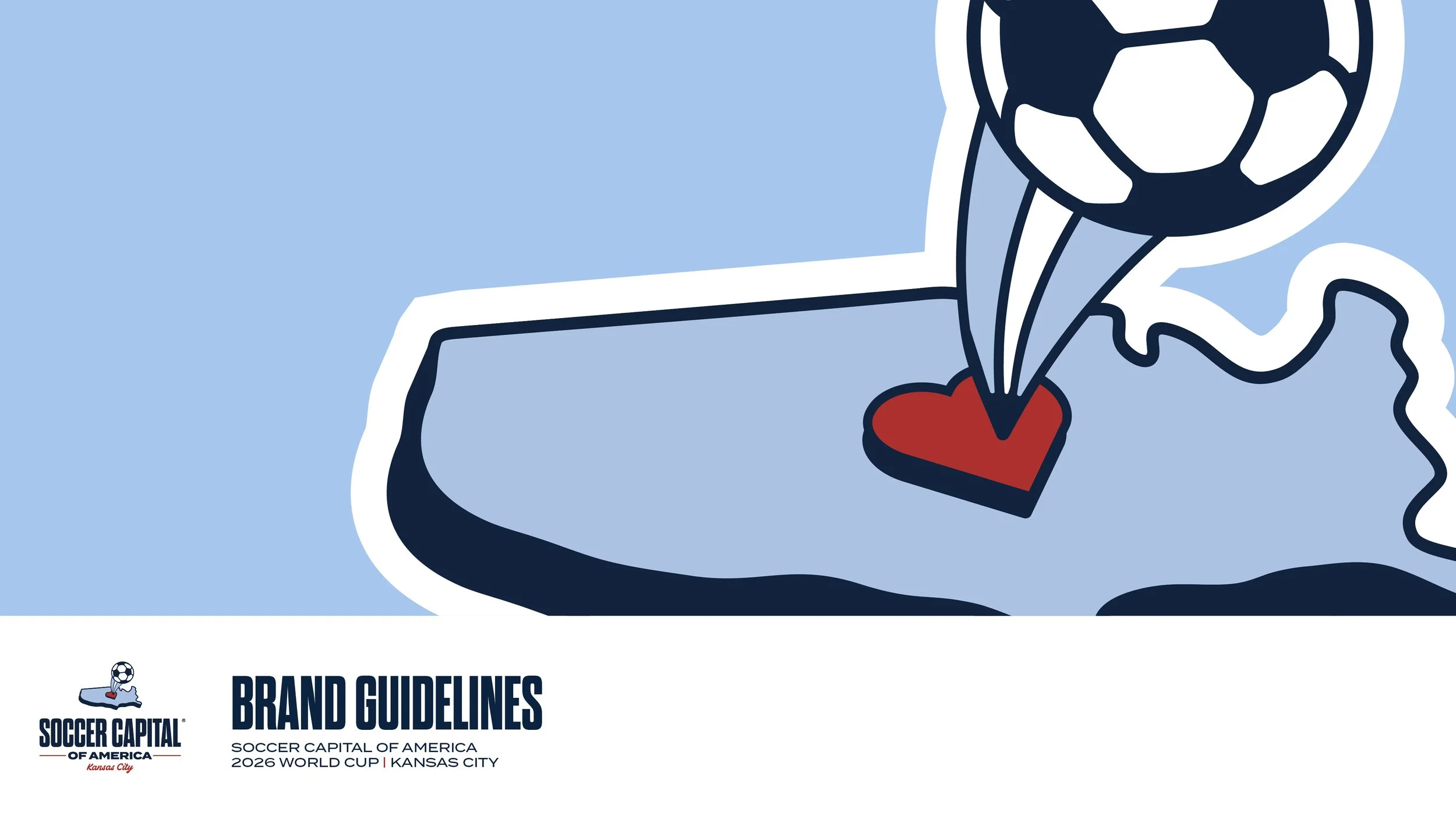
BRANDING IDENTITY & ILLUSTRATION
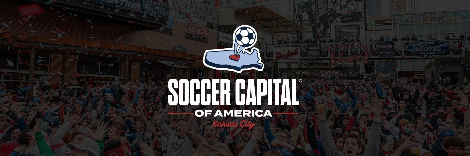
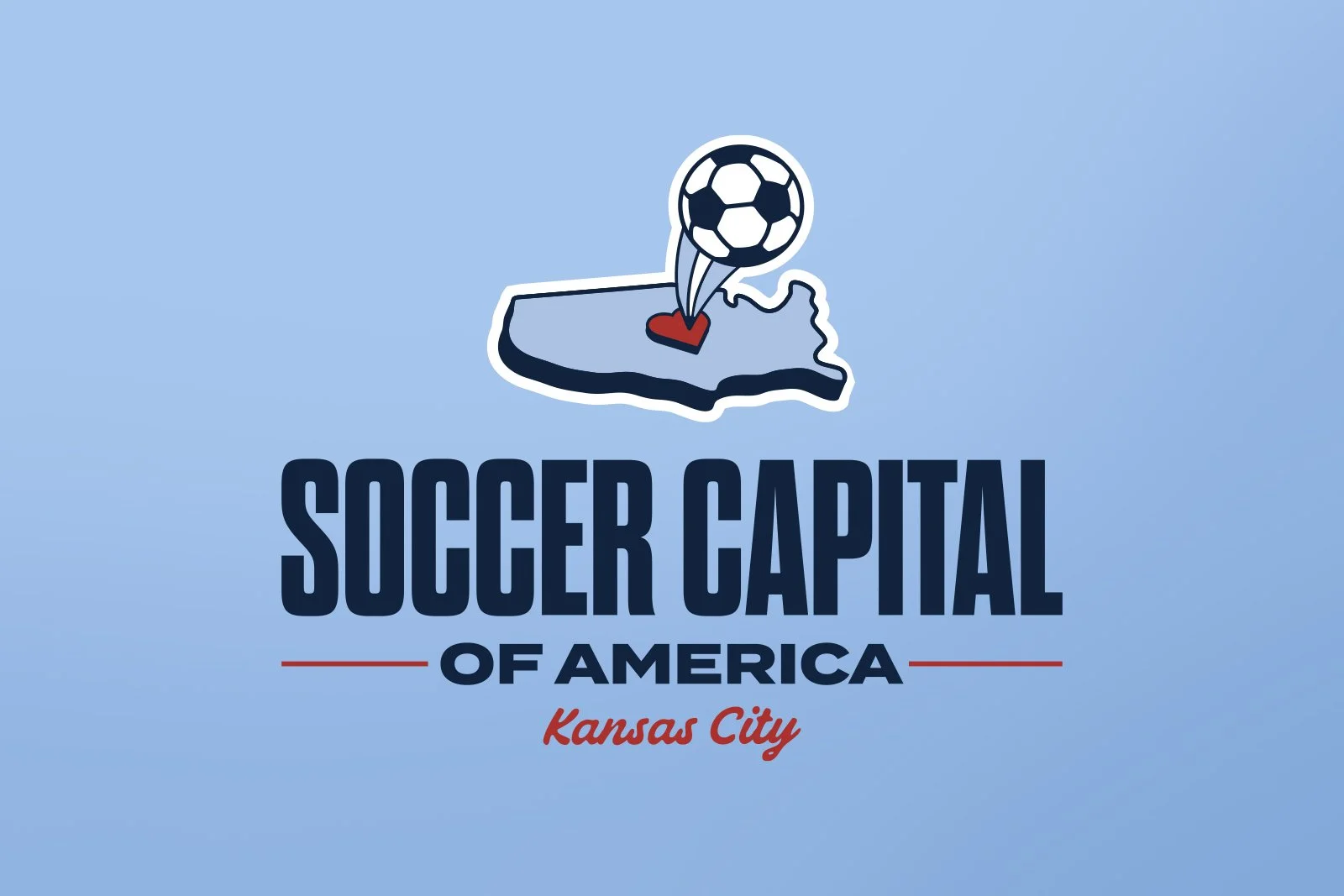
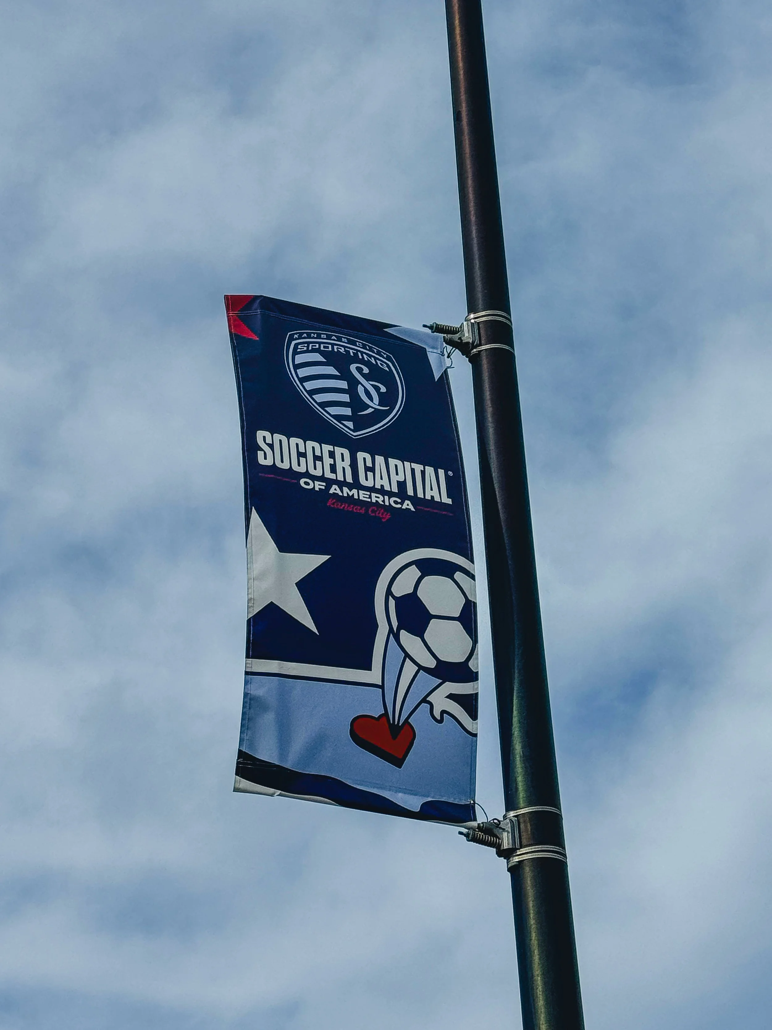
Soccer Capital of America
Challenge
As Kansas City prepares to host the 2026 FIFA World Cup, Sporting Kansas City sought to reinforce its identity as the heartbeat of the local soccer community. Despite holding the official trademark for the "Soccer Capital of America," a gap remained between the club’s modern brand and the city's deep-rooted soccer history. The primary goal was to bridge this gap by leveraging the World Cup's global spotlight to convert international/national visitors and new residents into long-term, loyal Sporting KC Fans.
Approach
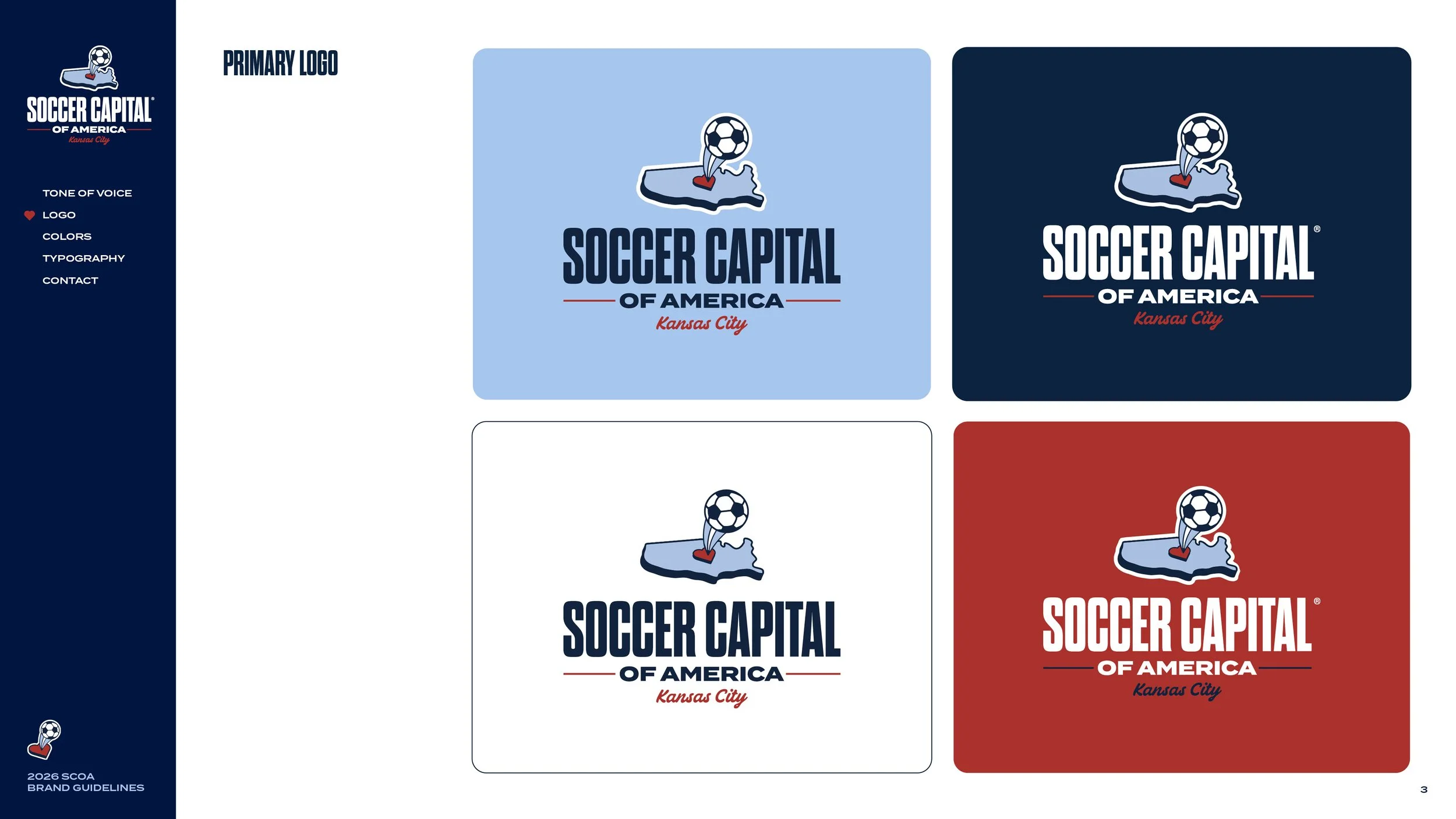
We developed a multi-tiered branding system that anchors Sporting KC’s identity within the national landscape. By centering the design on Kansas City’s 'Heartland' moniker, we established the city as the definitive geographical and cultural focal point of American soccer. We integrated the club’s signature colors and typography with U.S. iconography to visually show the 'Soccer Capital of America' trademark for a global audience.


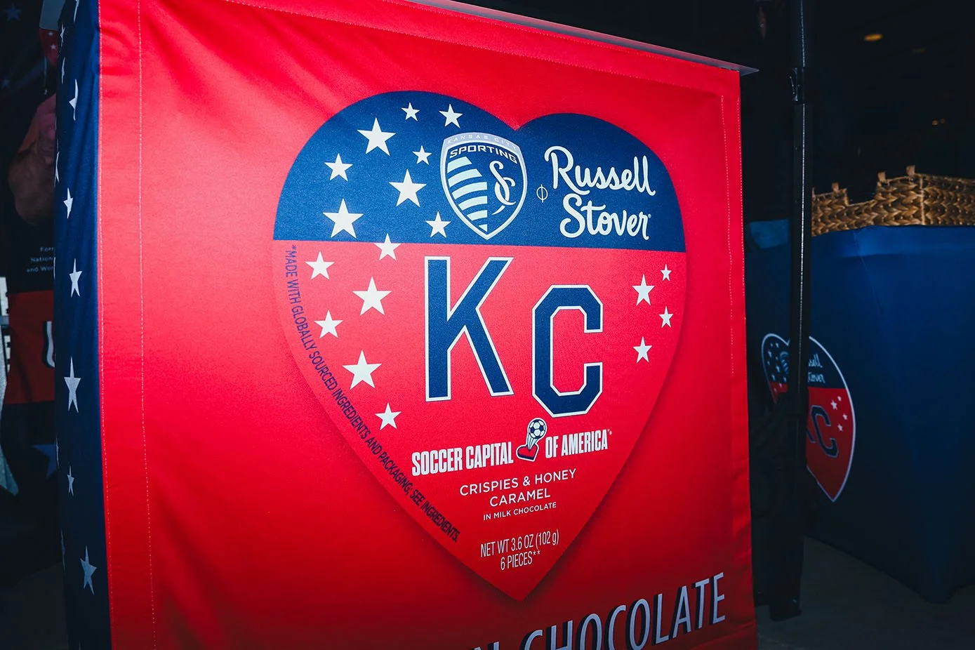
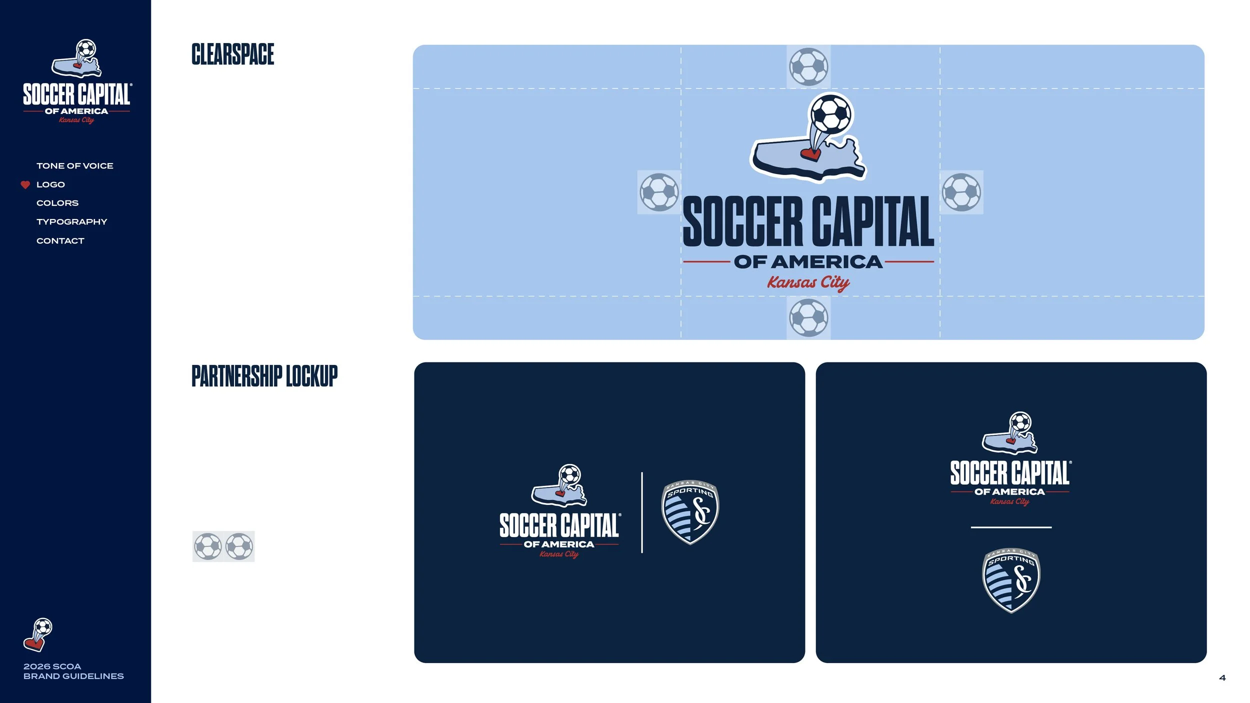
Developed as a co-branding initiative, this system was designed to drive local engagement through our corporate partnerships. These assets highlight how we worked alongside SKC partners to elevate Kansas City's profile as the Soccer Capital of America.
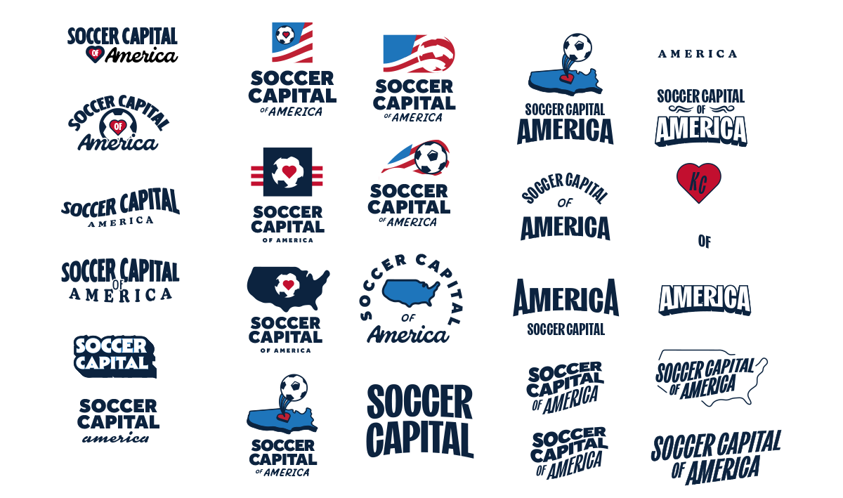
Process work
Exploration
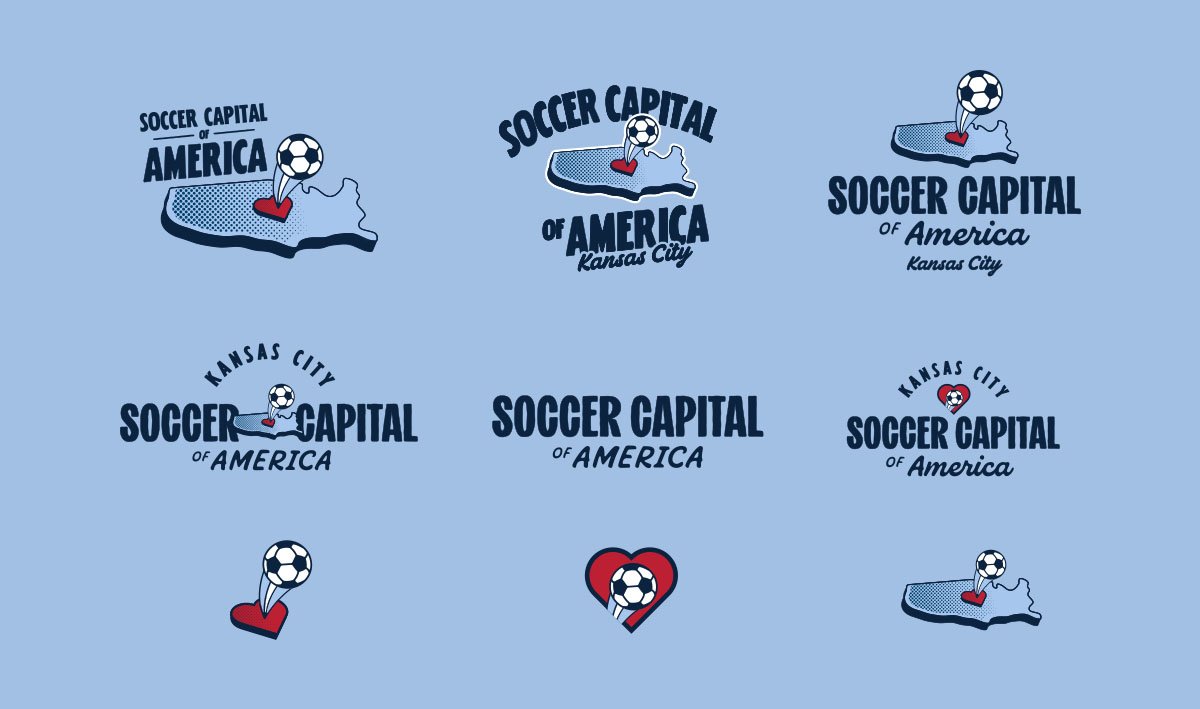
Refined variants exploration


The Team Behind the Creative
Creative Director: Nate Saathoff
Lead Designers: Sayler Rivas, Max Paxton
Photo Team: Alex Lorenzo, Jessi Carpenter, Kyleigh Rowe, Max Paxton, Sayler Rivas