
BRANDING IDENTITY & ENVIRONMENTAL DESIGN
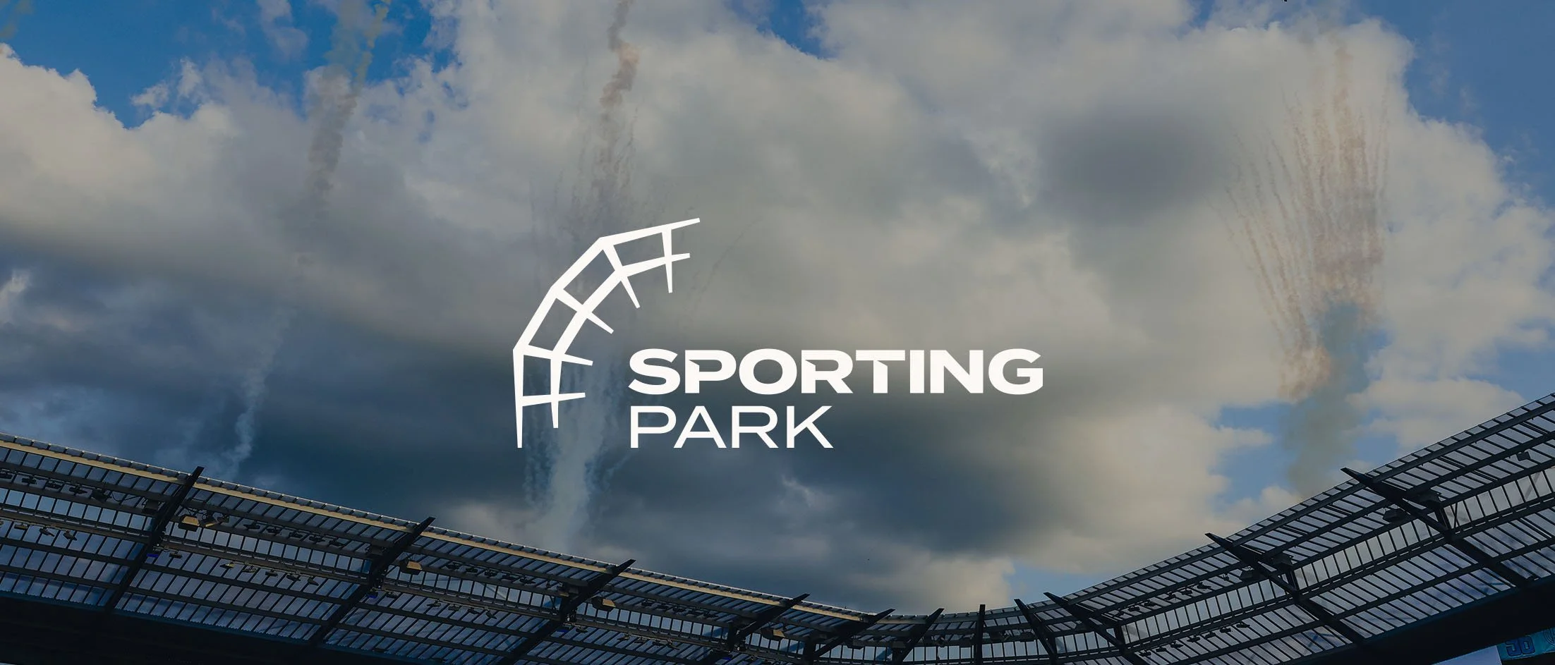
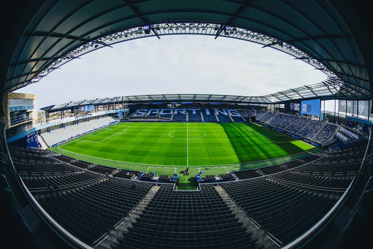
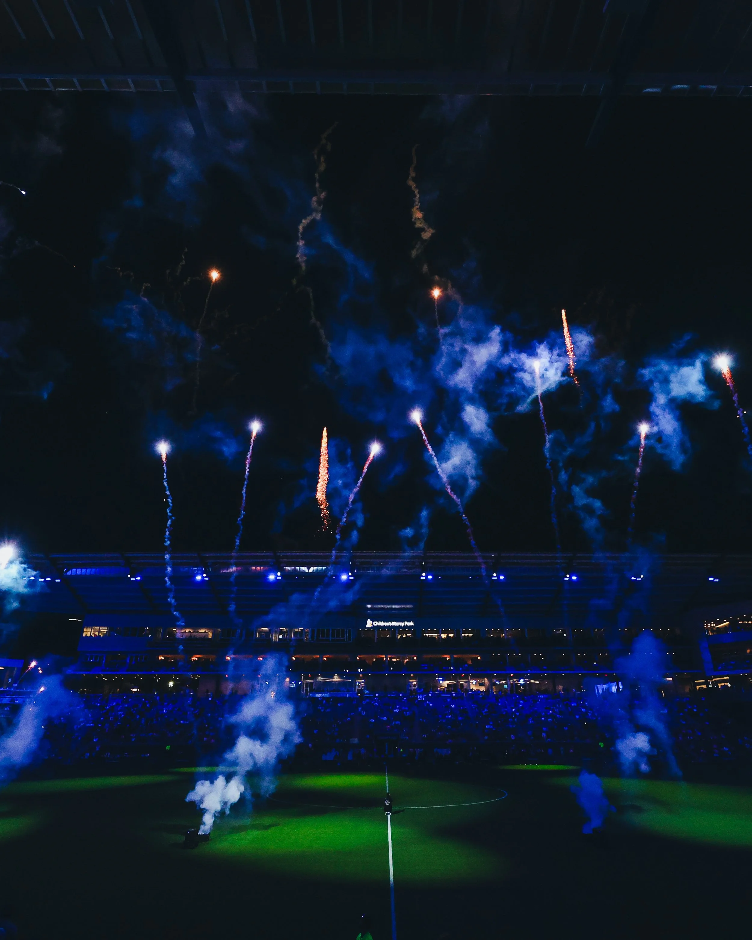
Sporting Park
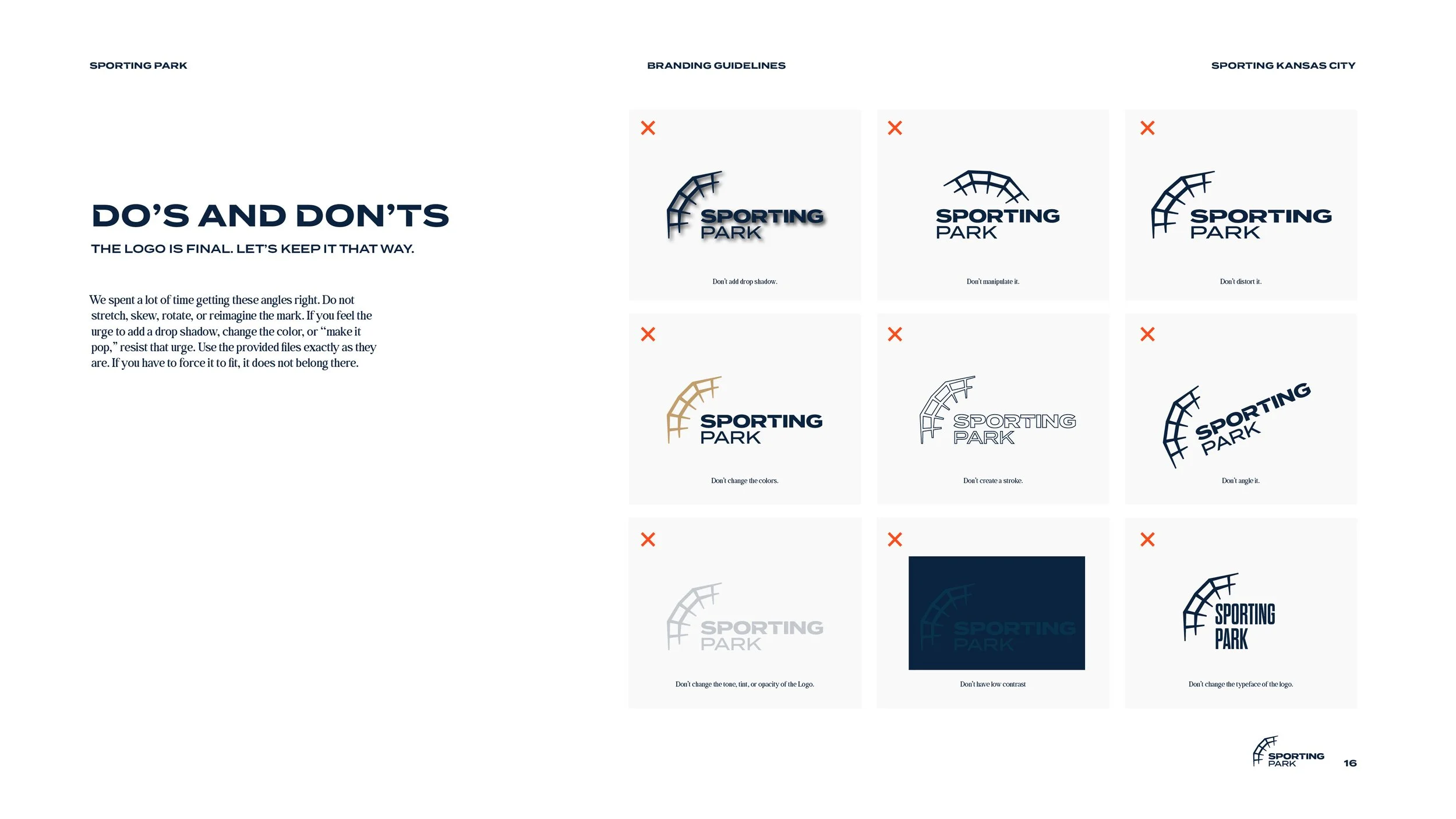
Challenge
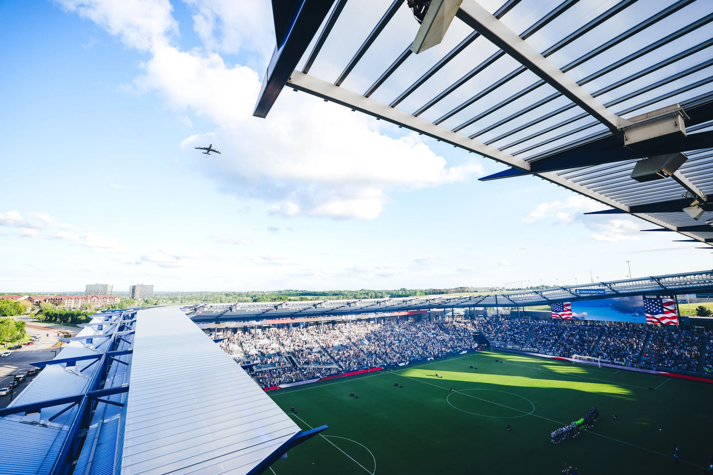
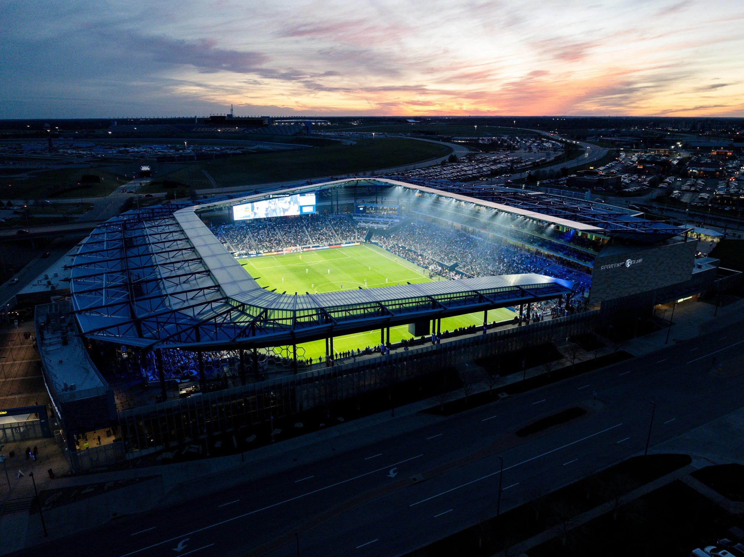
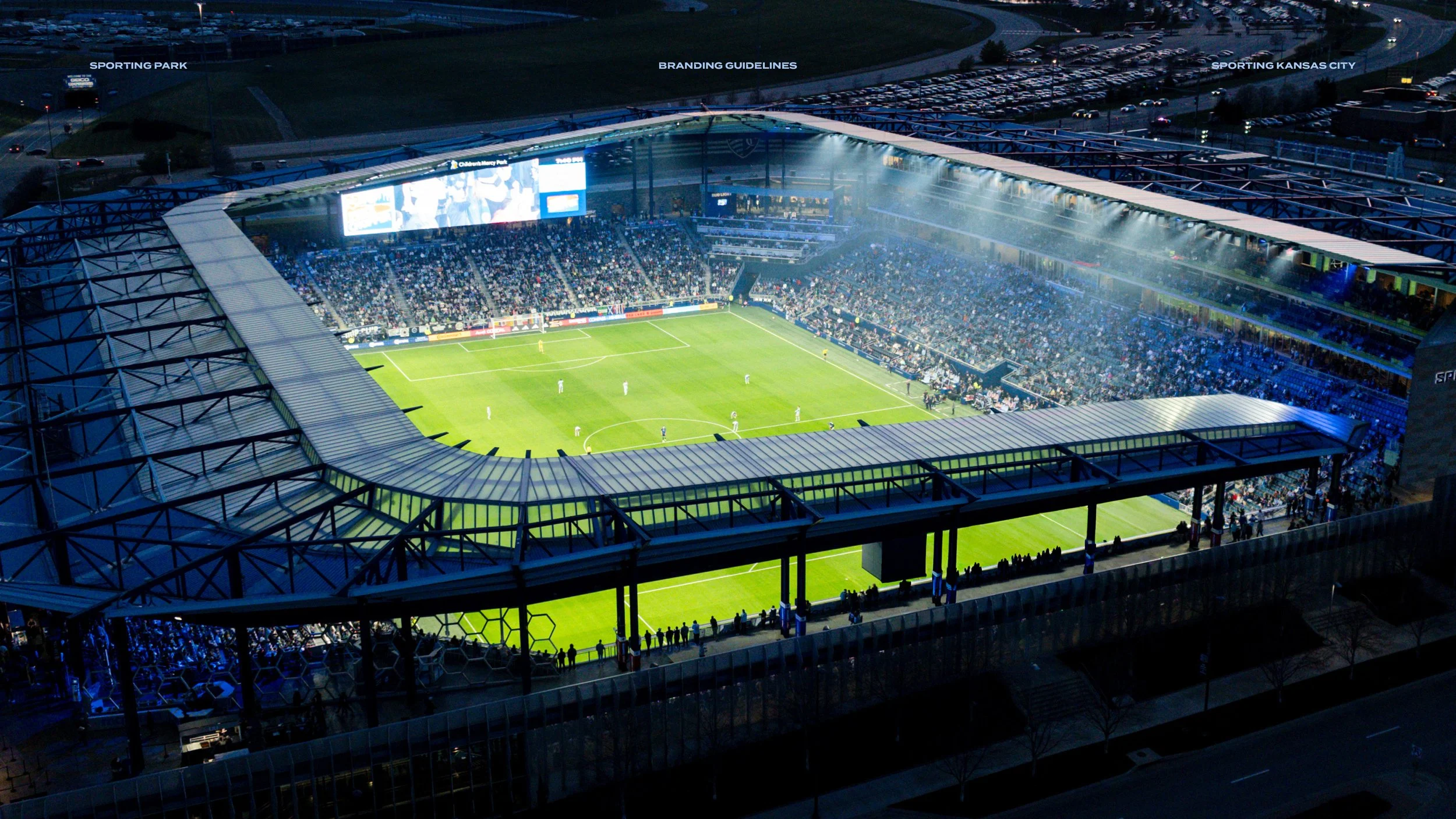
Following the conclusion of a decade-long partnership with Children’s Mercy, Sporting Kansas City’s stadium returned to its roots as Sporting Park. This transition presented a unique design challenge, rebuilding the stadium’s identity from the ground up. Our goal was to leverage environmental branding to anchor the venue in the club’s branding. This leads to transforming a naming rights shift into a premium, memorable experience that resonates with fans and employees alike.
Approach
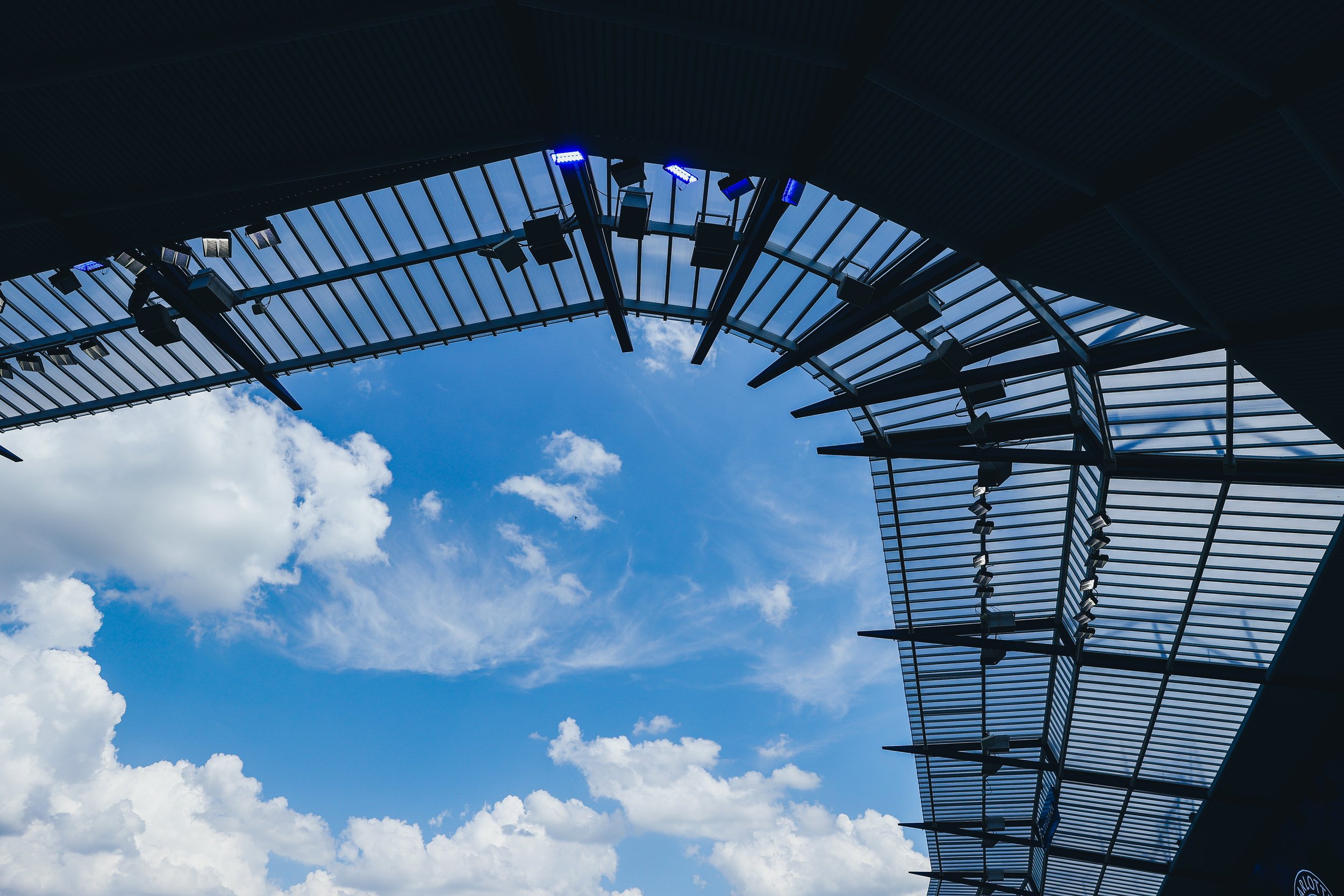
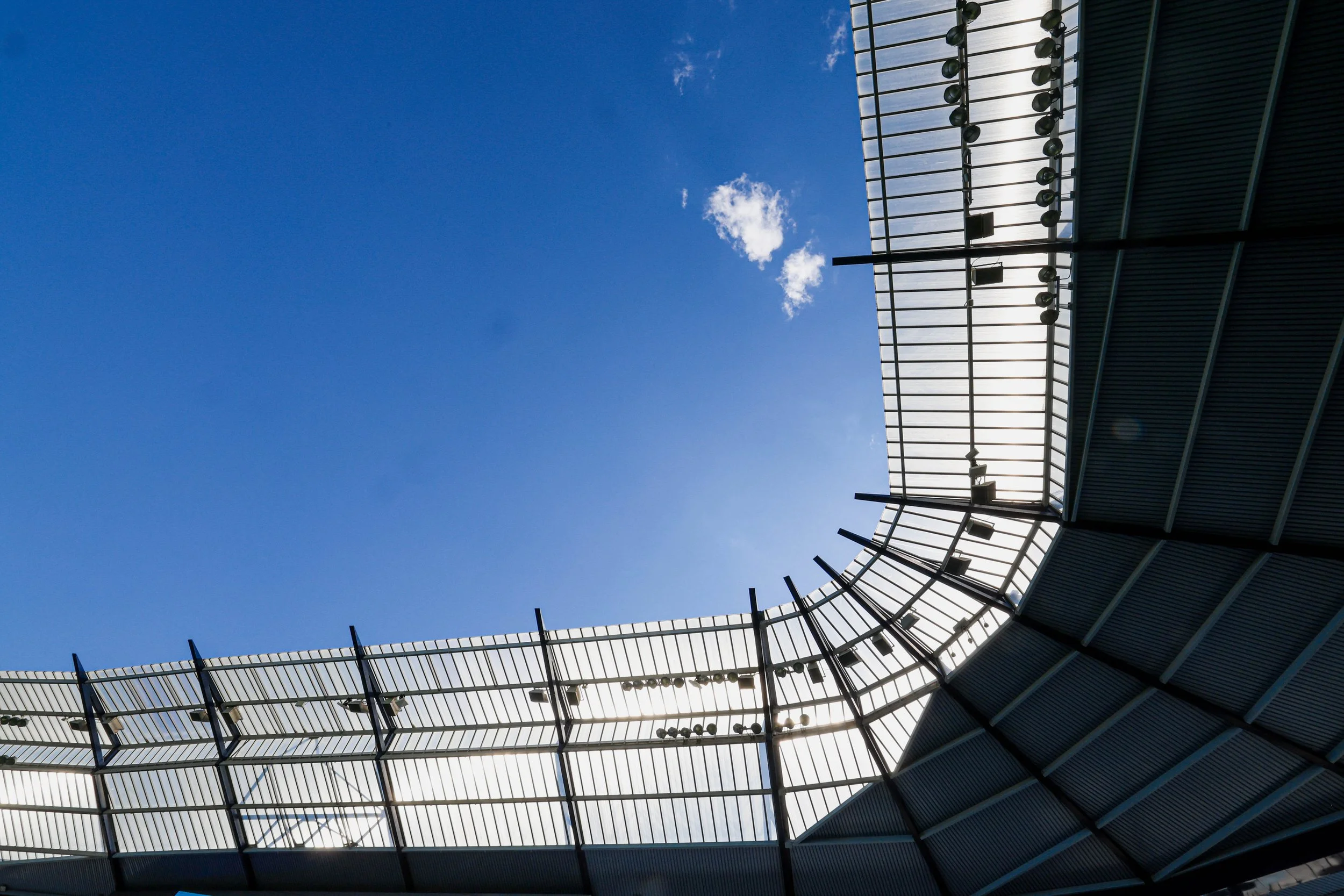
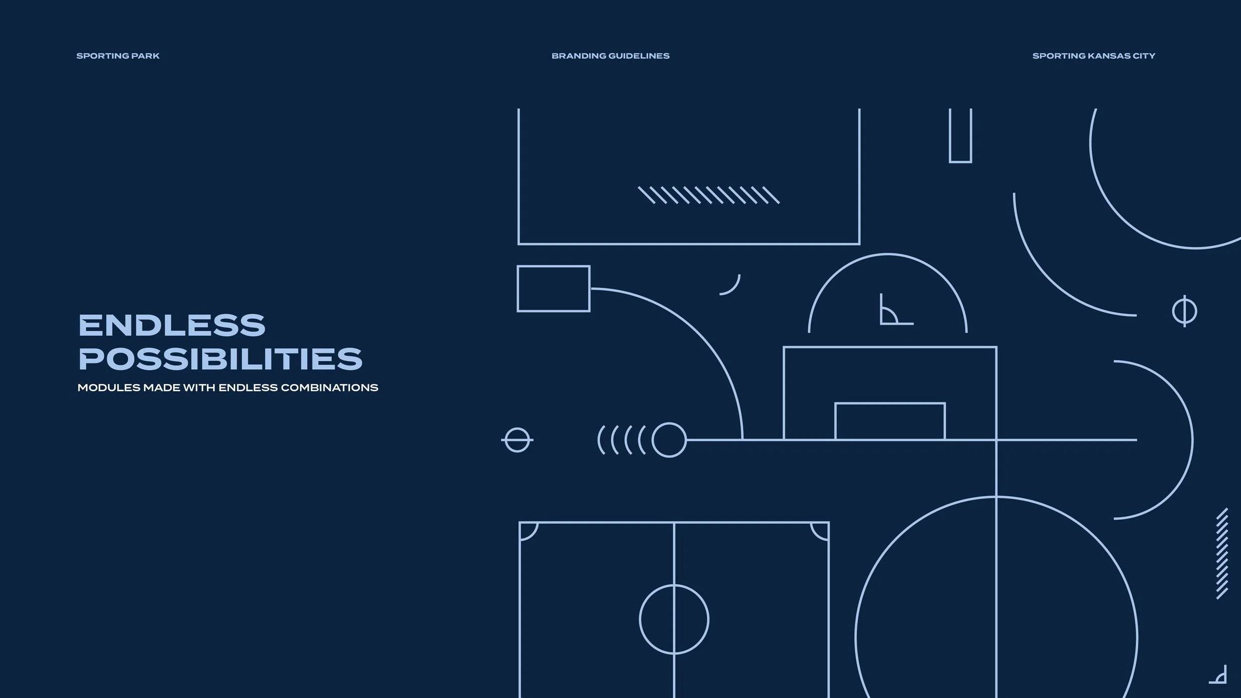
Our design approach centered on a macro and micro-level audit of the stadium’s architectural DNA to develop a modular "kit of parts." We drew direct inspiration from the venue’s iconic roofline silhouette, the angled videoboard, and the pitch's geometry. By translating these structural signatures into a cohesive branded system, we created a contextual visual language that reinforces the stadium's identity and deepens its connection to Sporting Kansas City.
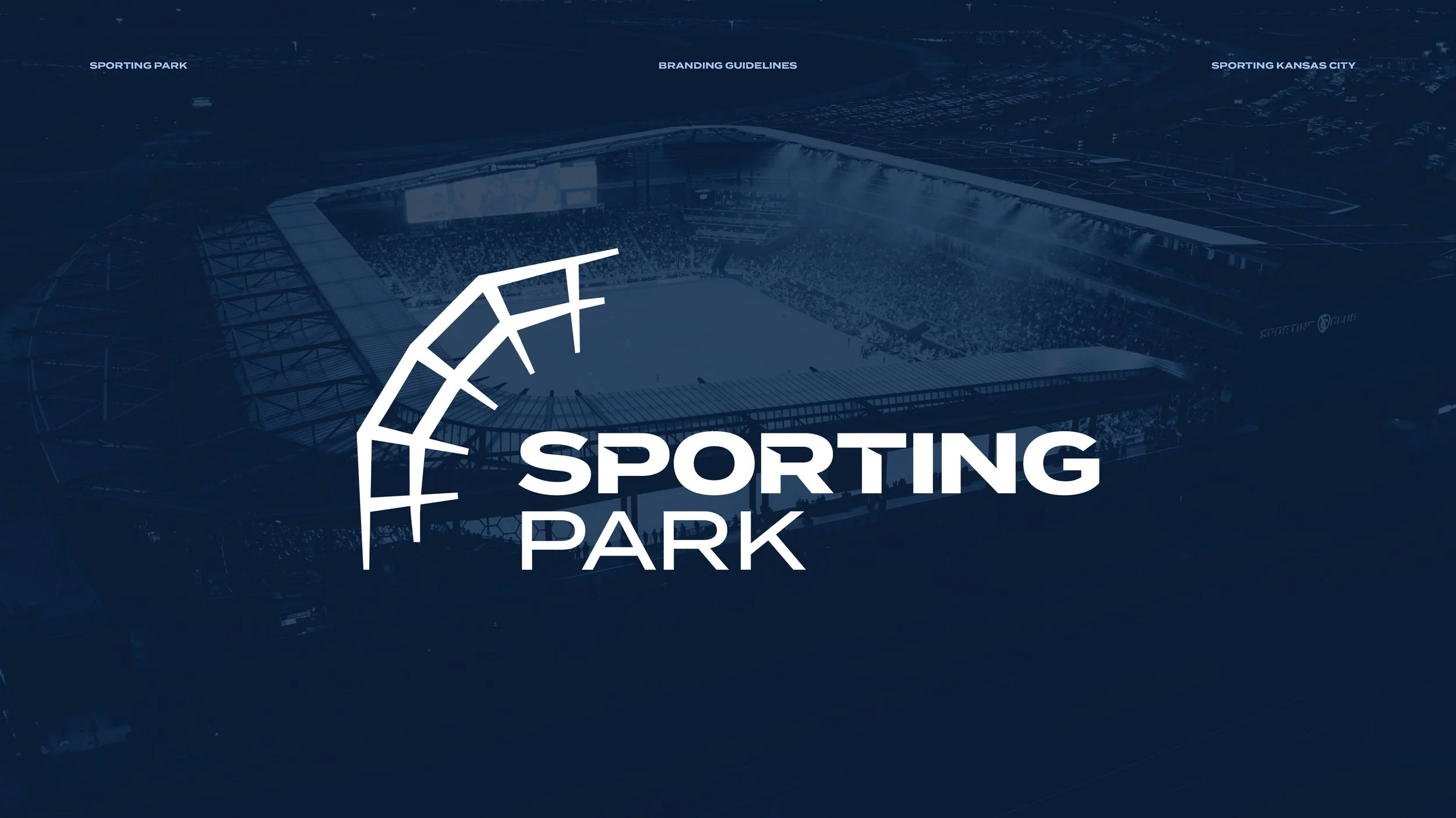
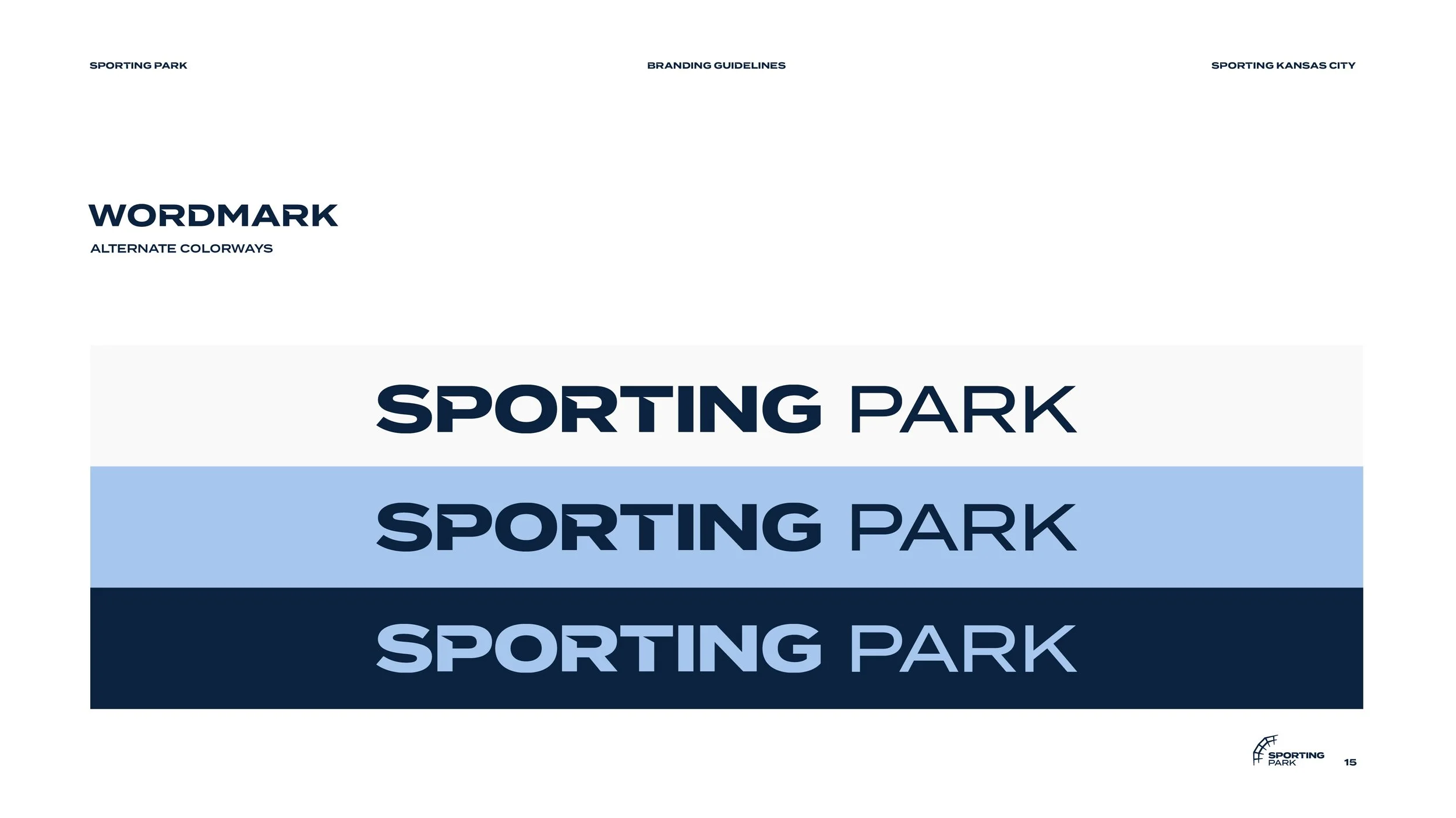
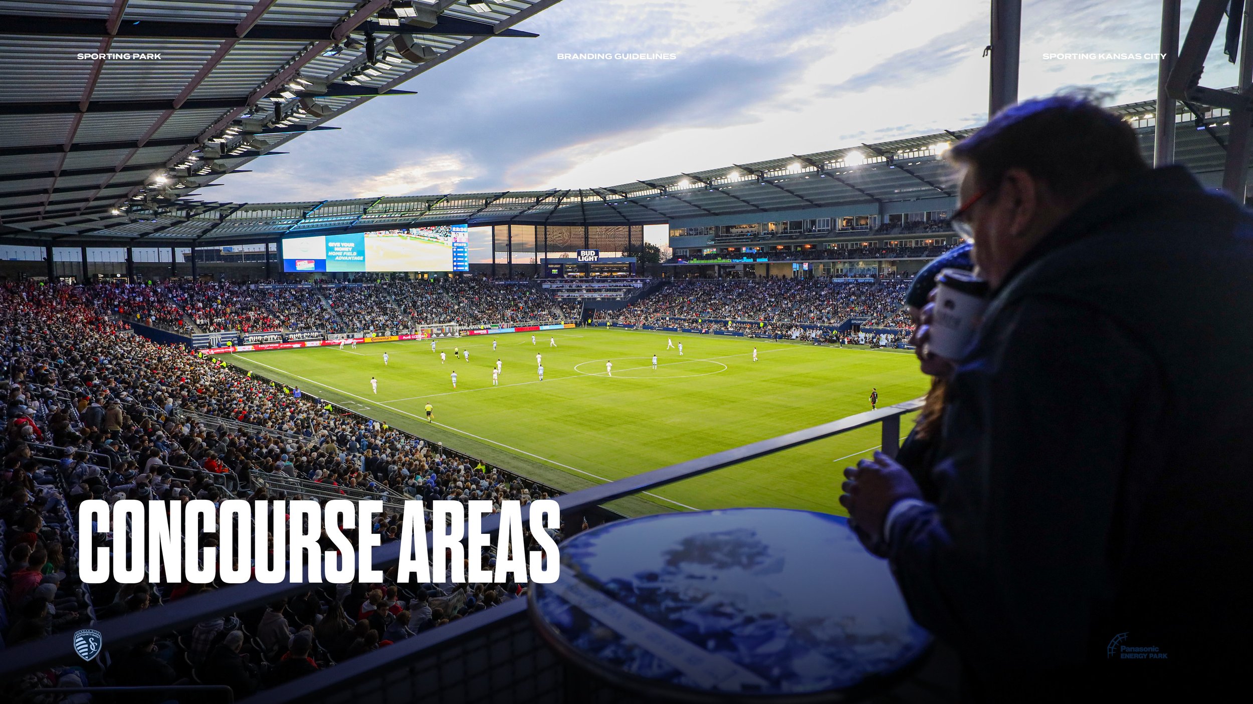
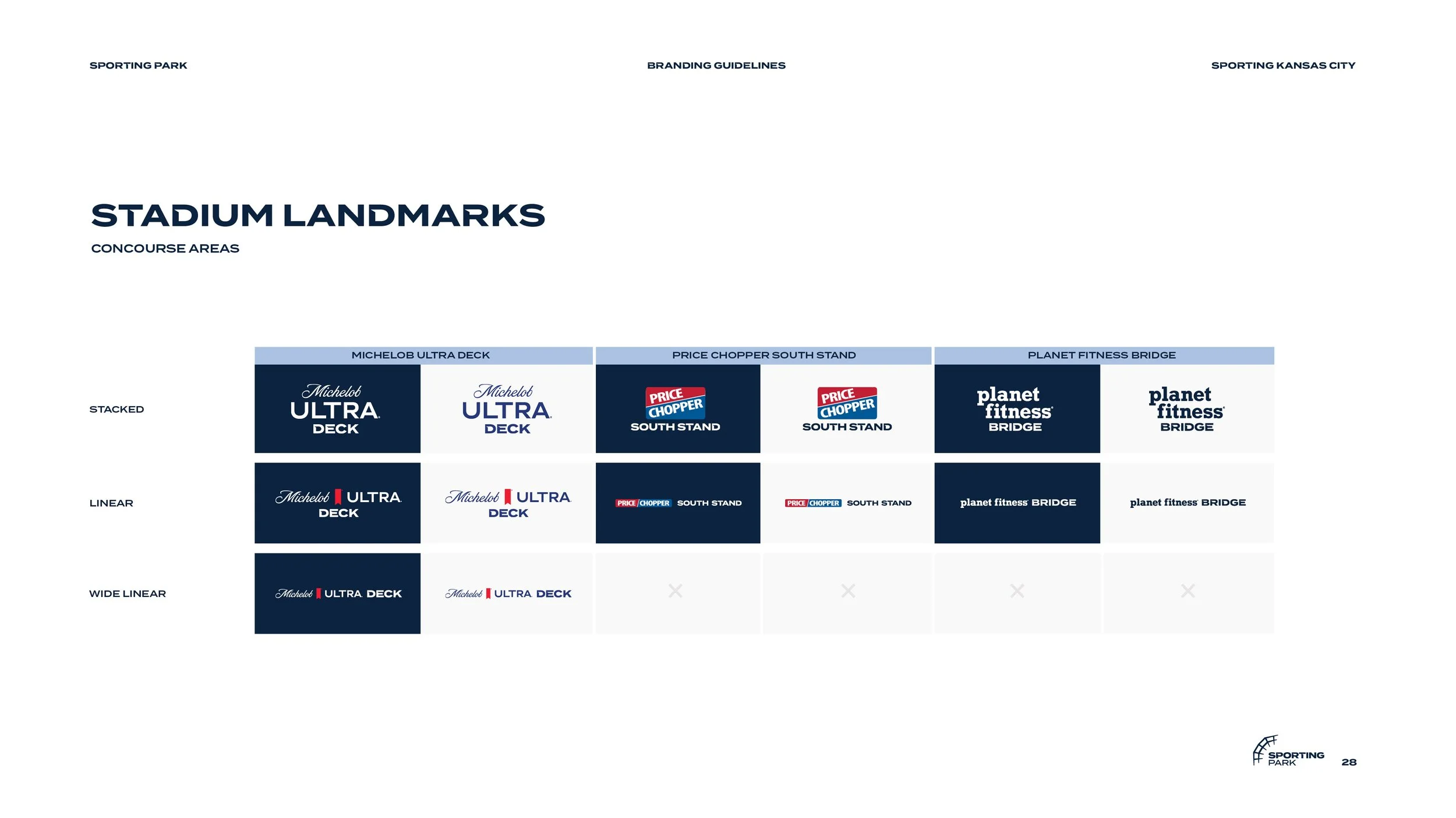
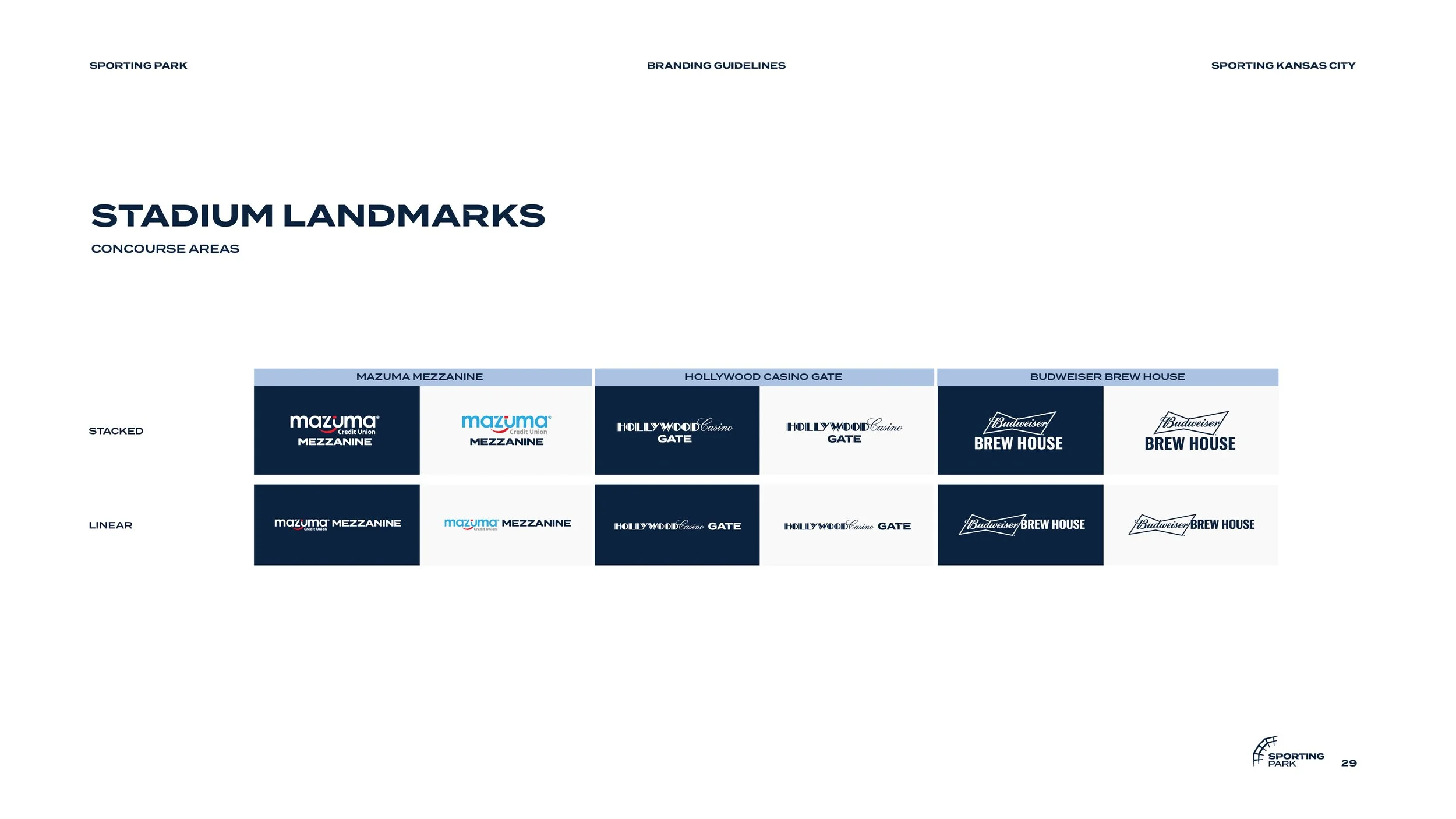
Logo System
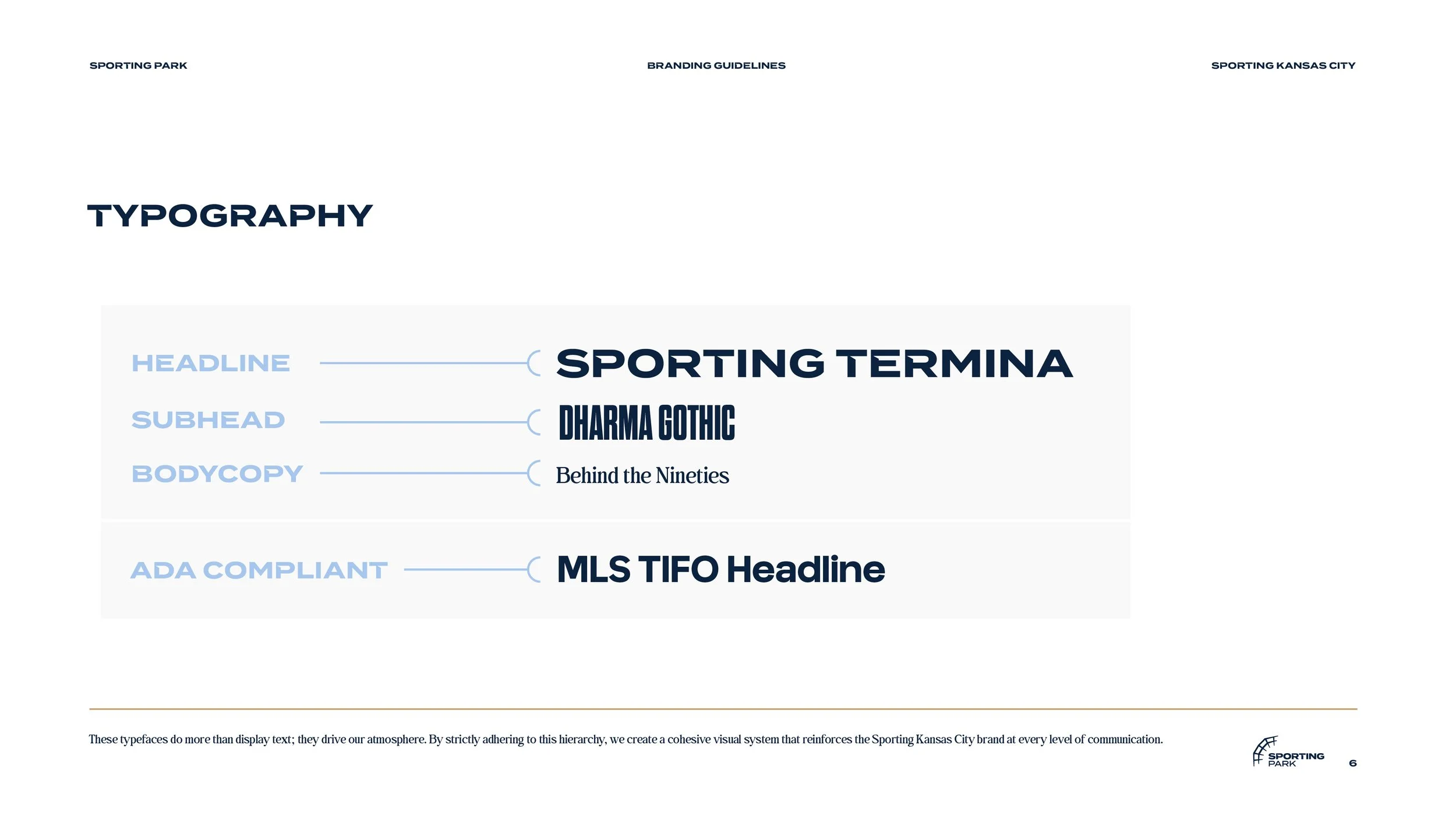
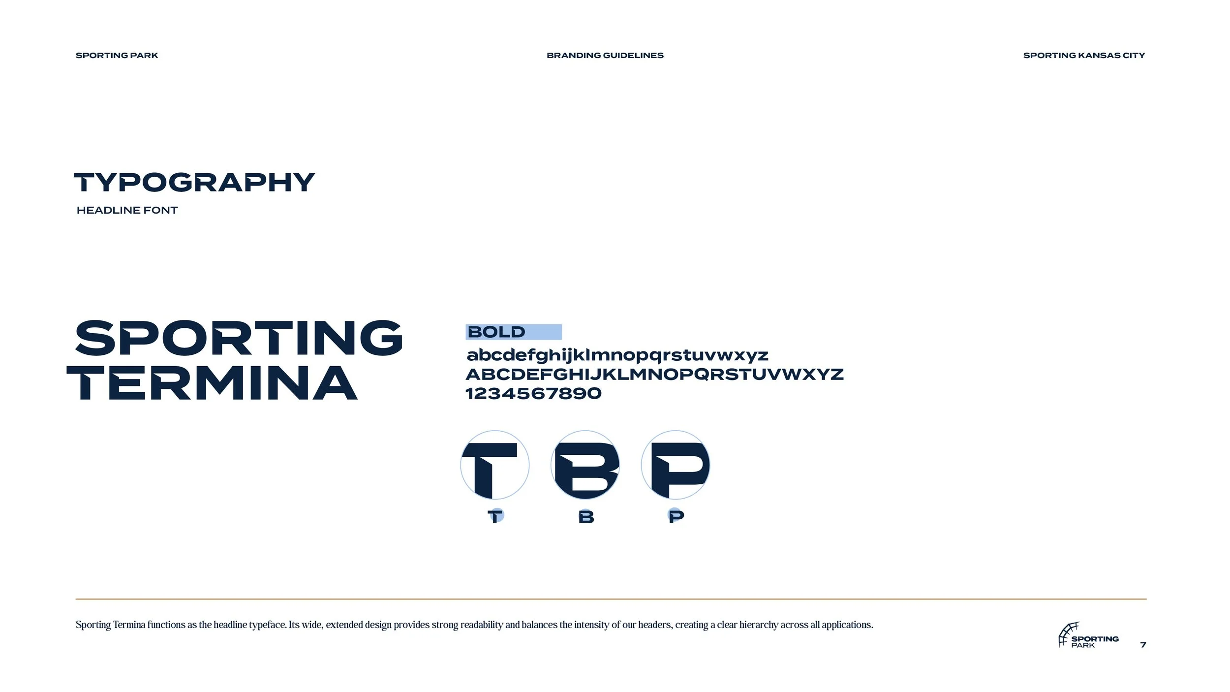
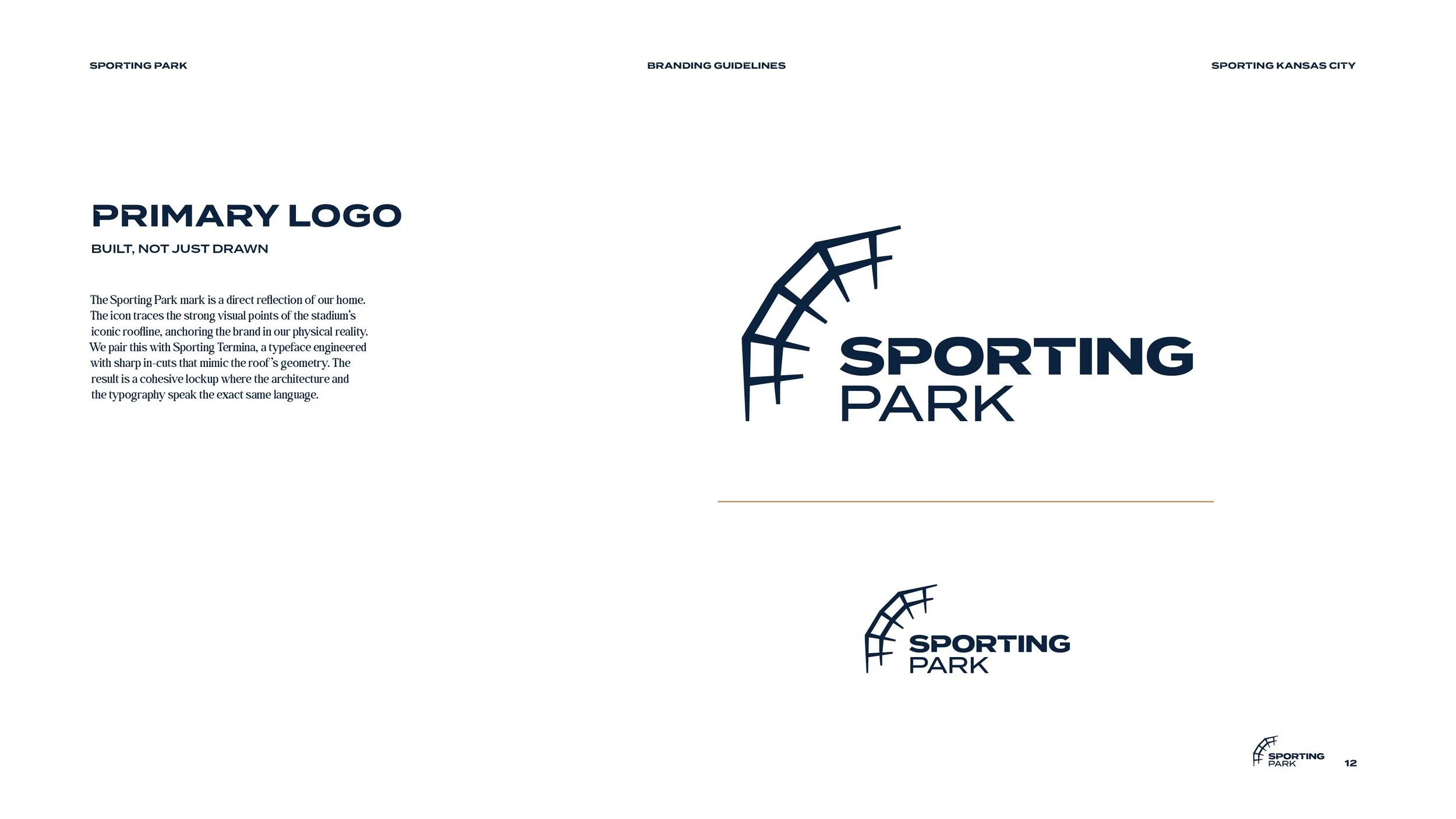
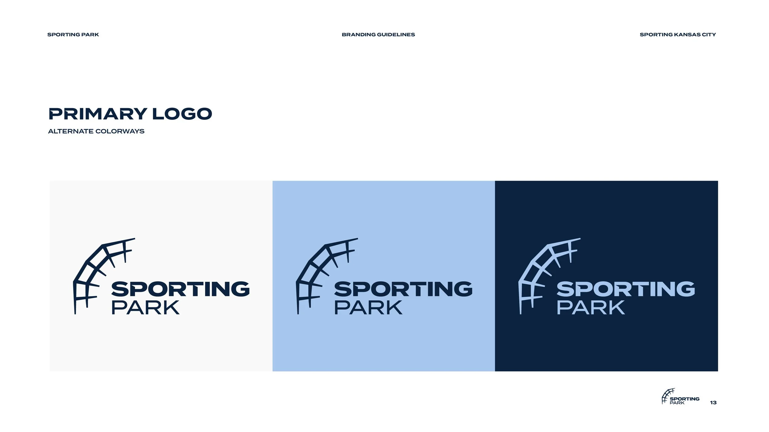
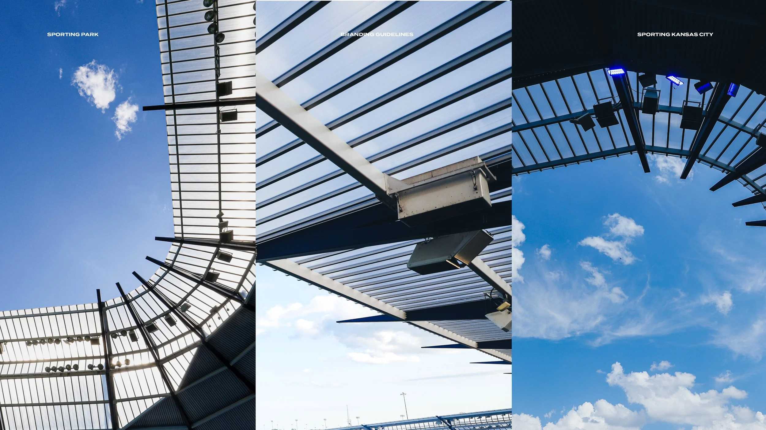
The primary park traces the stadium’s iconic roofline. We pair this with Sporting Termina, a typeface engineered with sharp in-cuts that mimic the roof’s geometry. The result is a cohesive lockup where the architecture and the typography speak the exact same language.
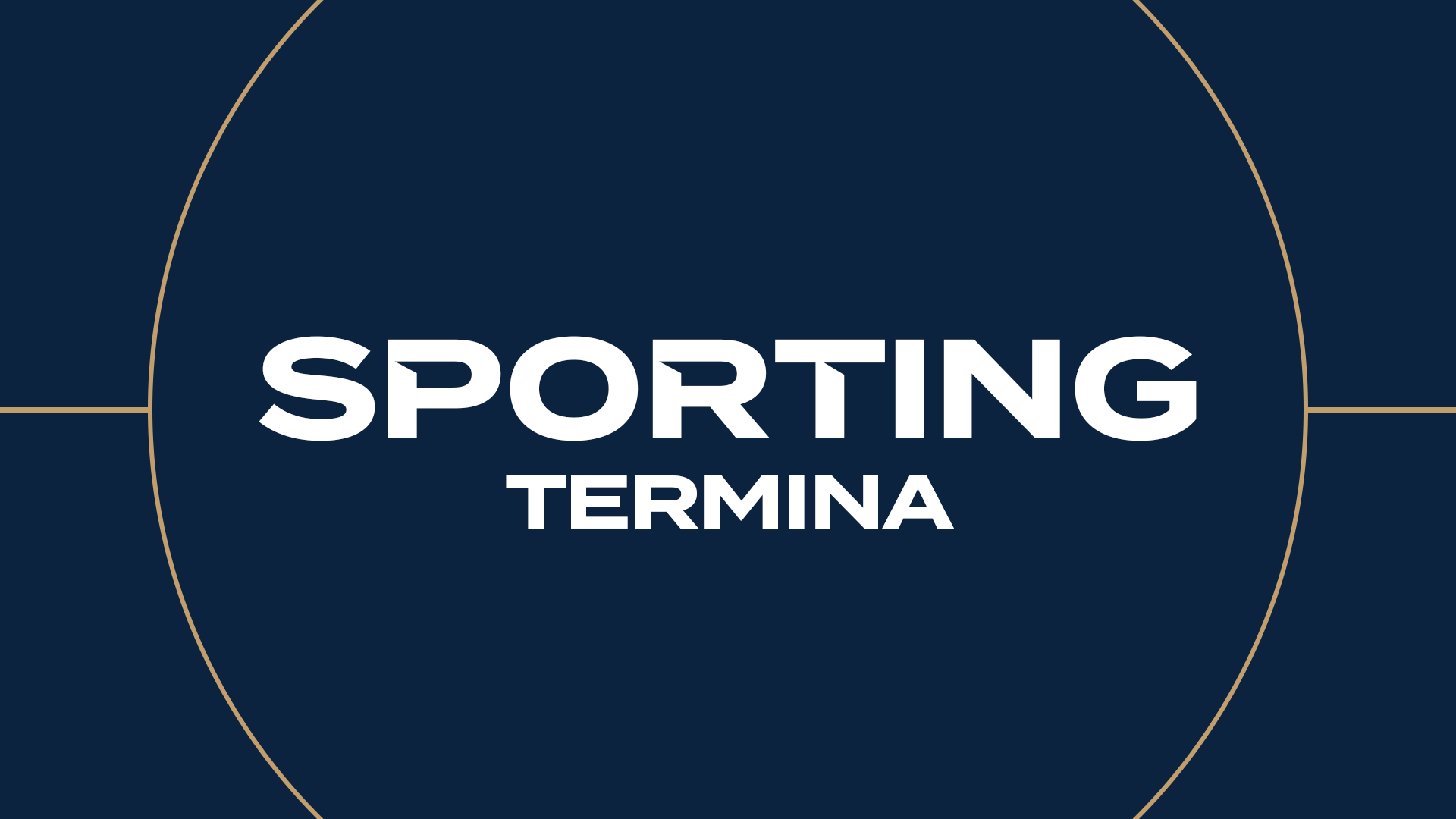
The Adobe font, “Termina” is a typeface that was engineered with sharp in-cuts to mimic the roofline’s geometry.

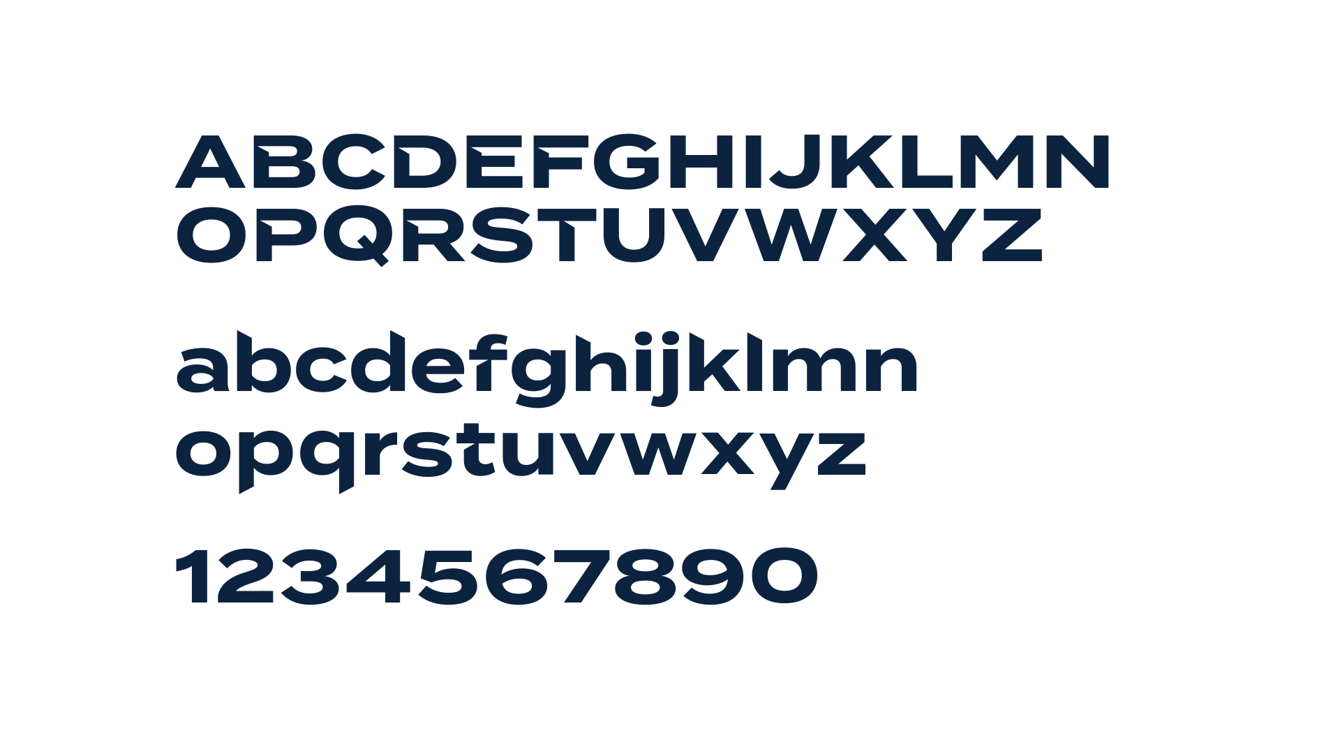
Sporting Termina
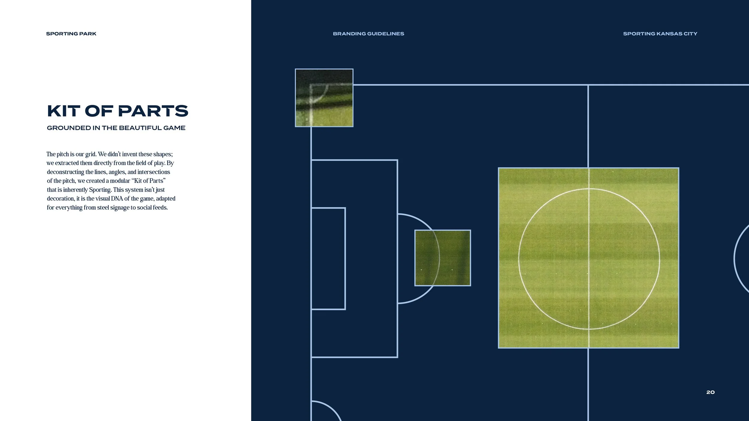
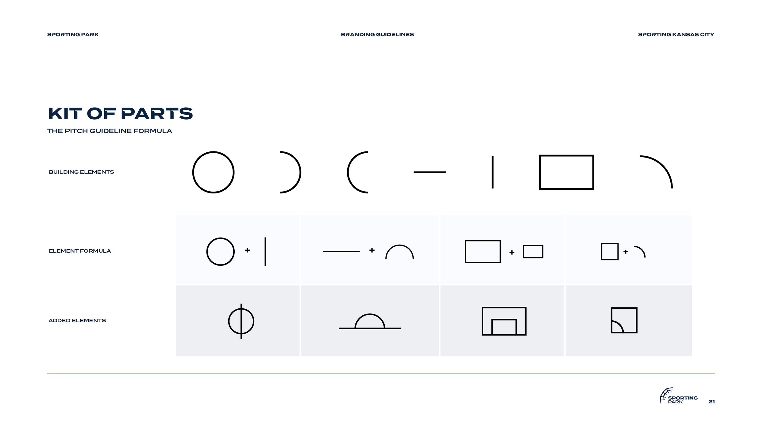
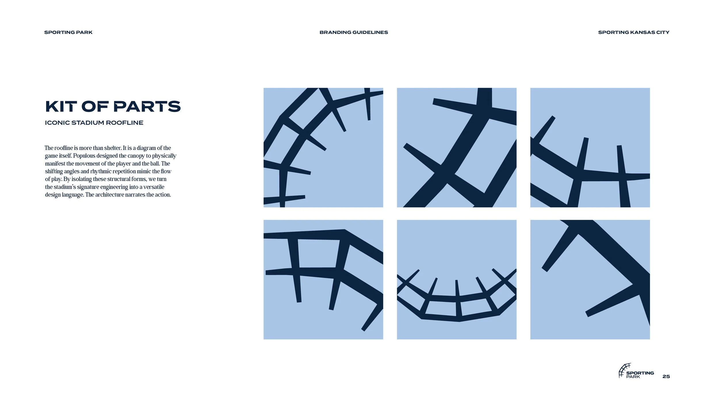
Kit of Parts
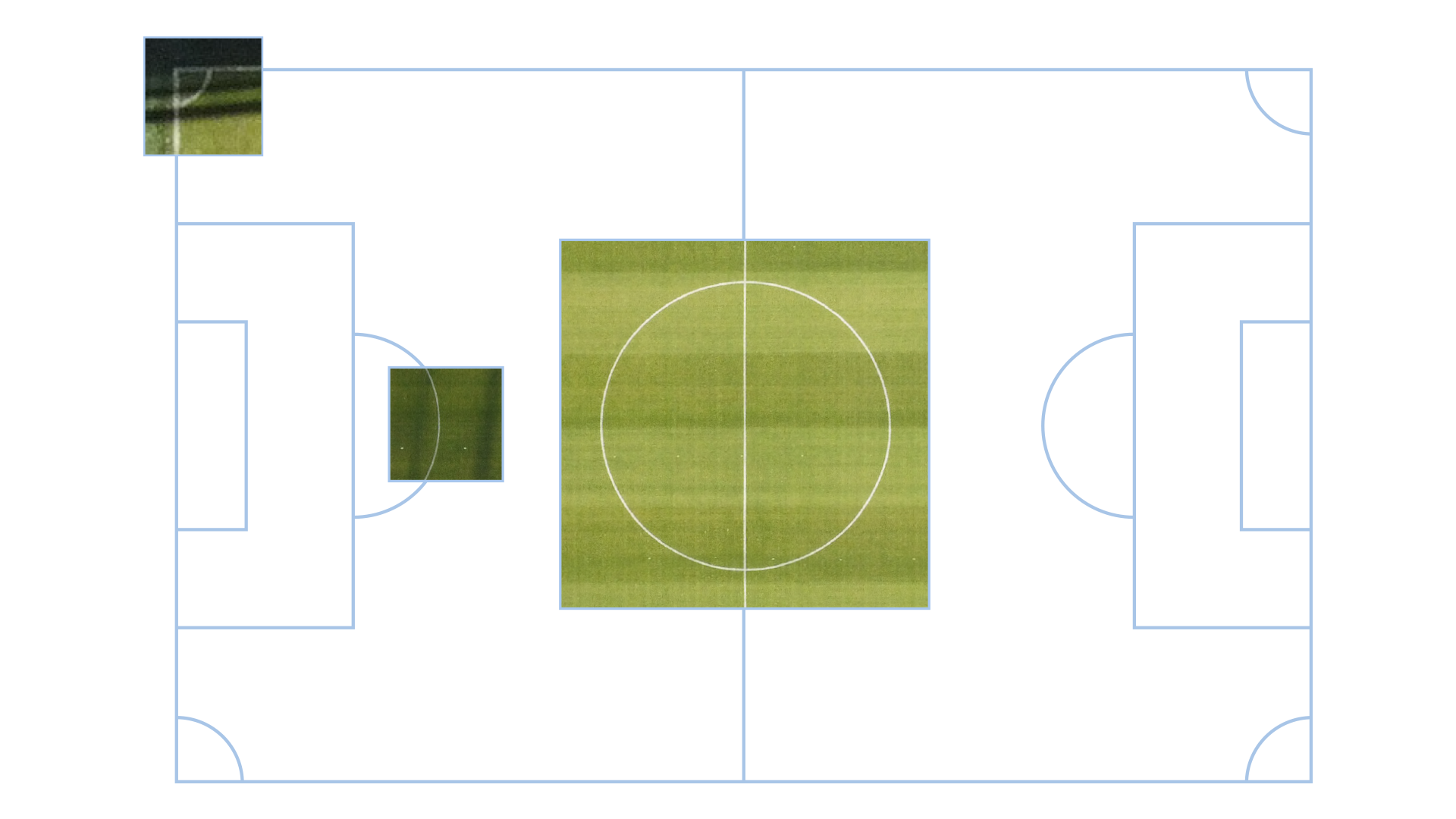
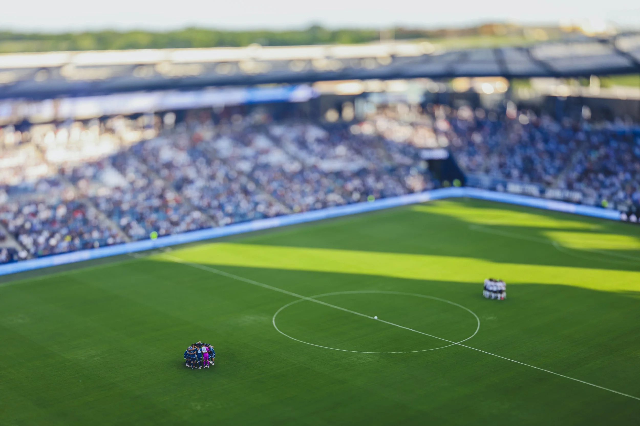
By deconstructing the lines, angles, and intersections of the pitch, this created a modular “Kit of Parts”. This system isn’t just decoration; it is the visual DNA of the game, adapted for everything from steel signage to social feeds.
Guideline Formula
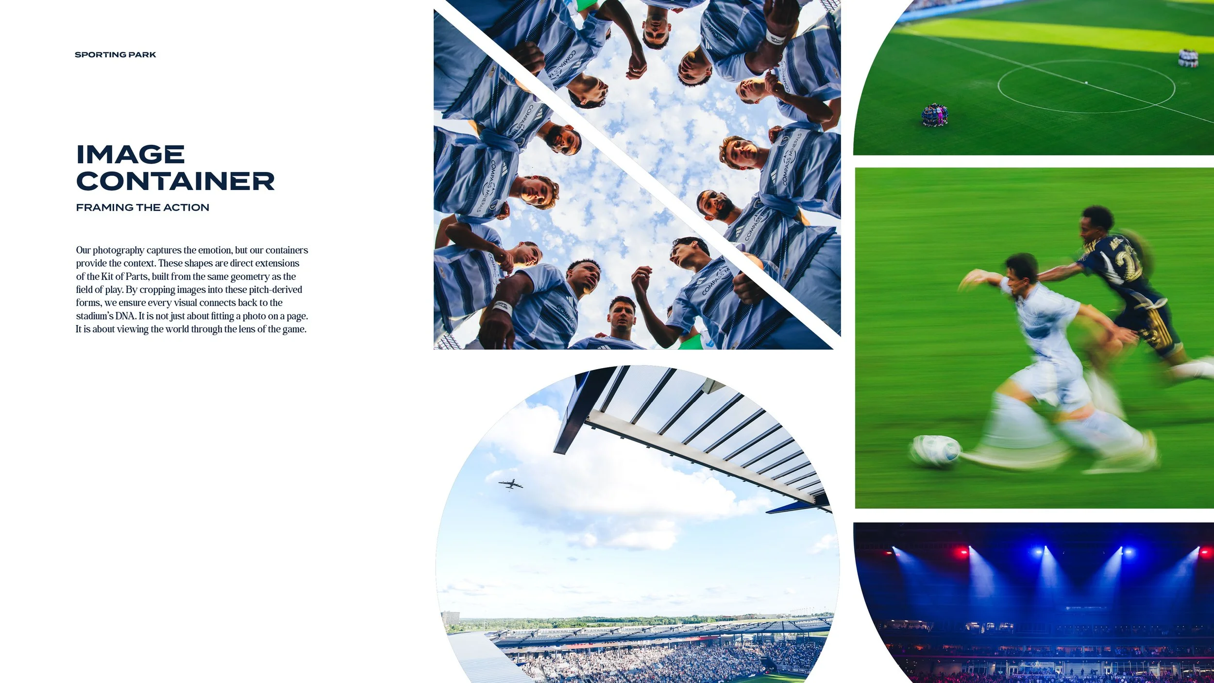
Shape Containers
The Team Behind the Creative
Creative Director: Nate Saathoff
Lead Designer: Sayler Rivas
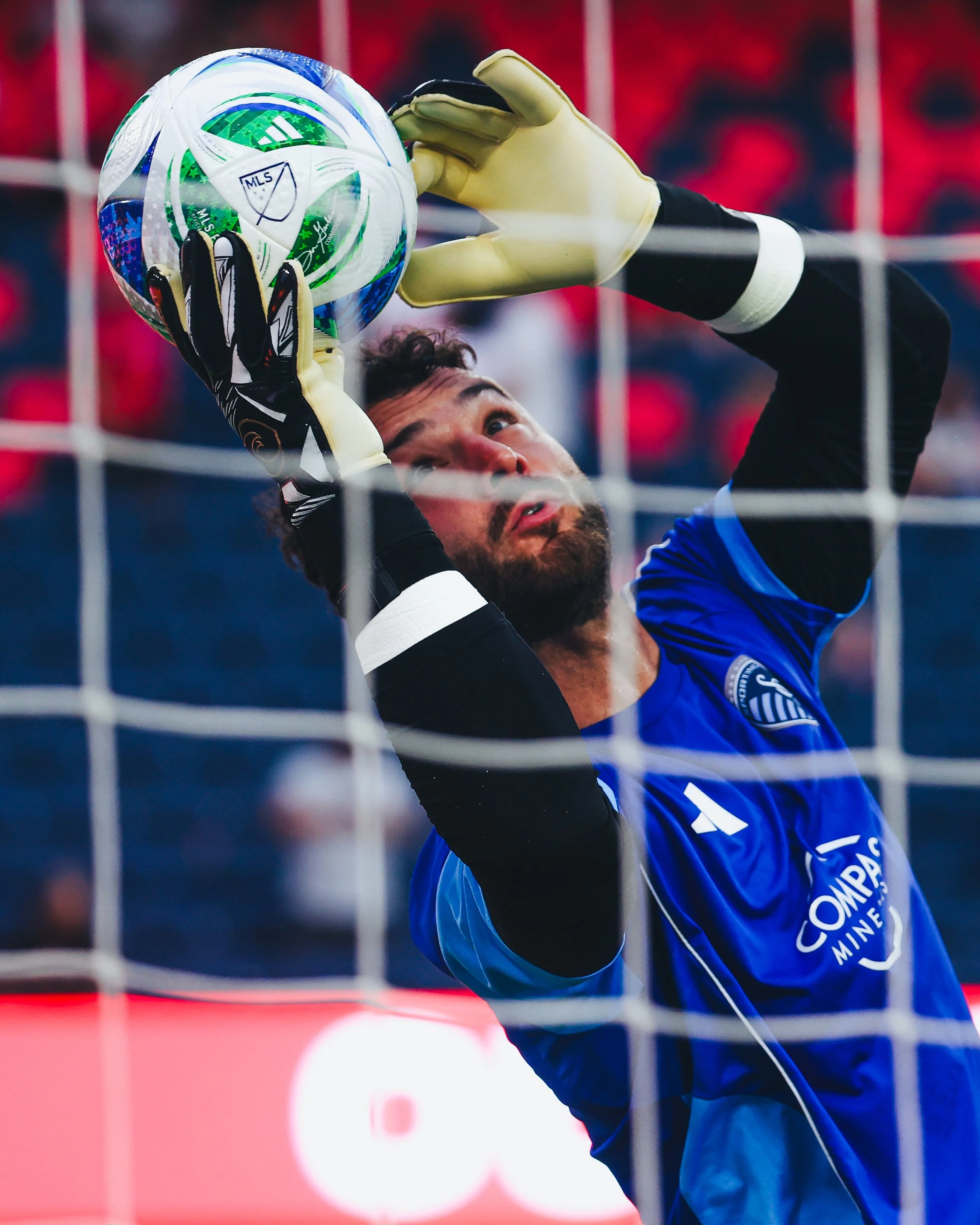
Photo Team: Alex Lorenzo, Jessi Carpenter, Kyleigh Rowe, Max Paxton, Sayler Rivas